City of Chicago
Positioning + naming
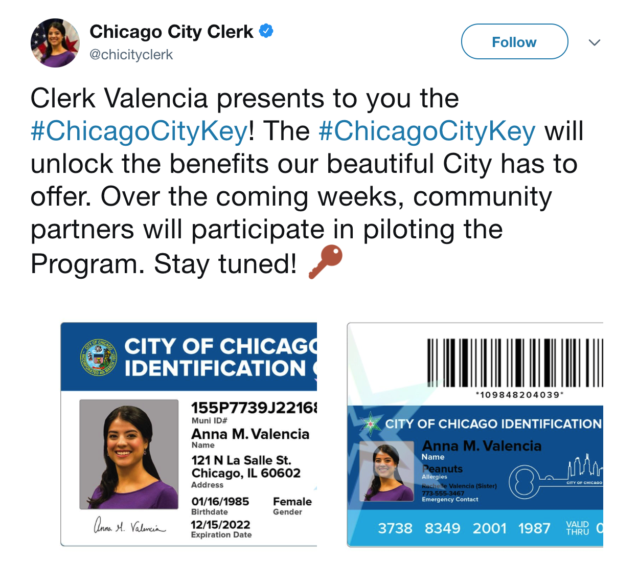
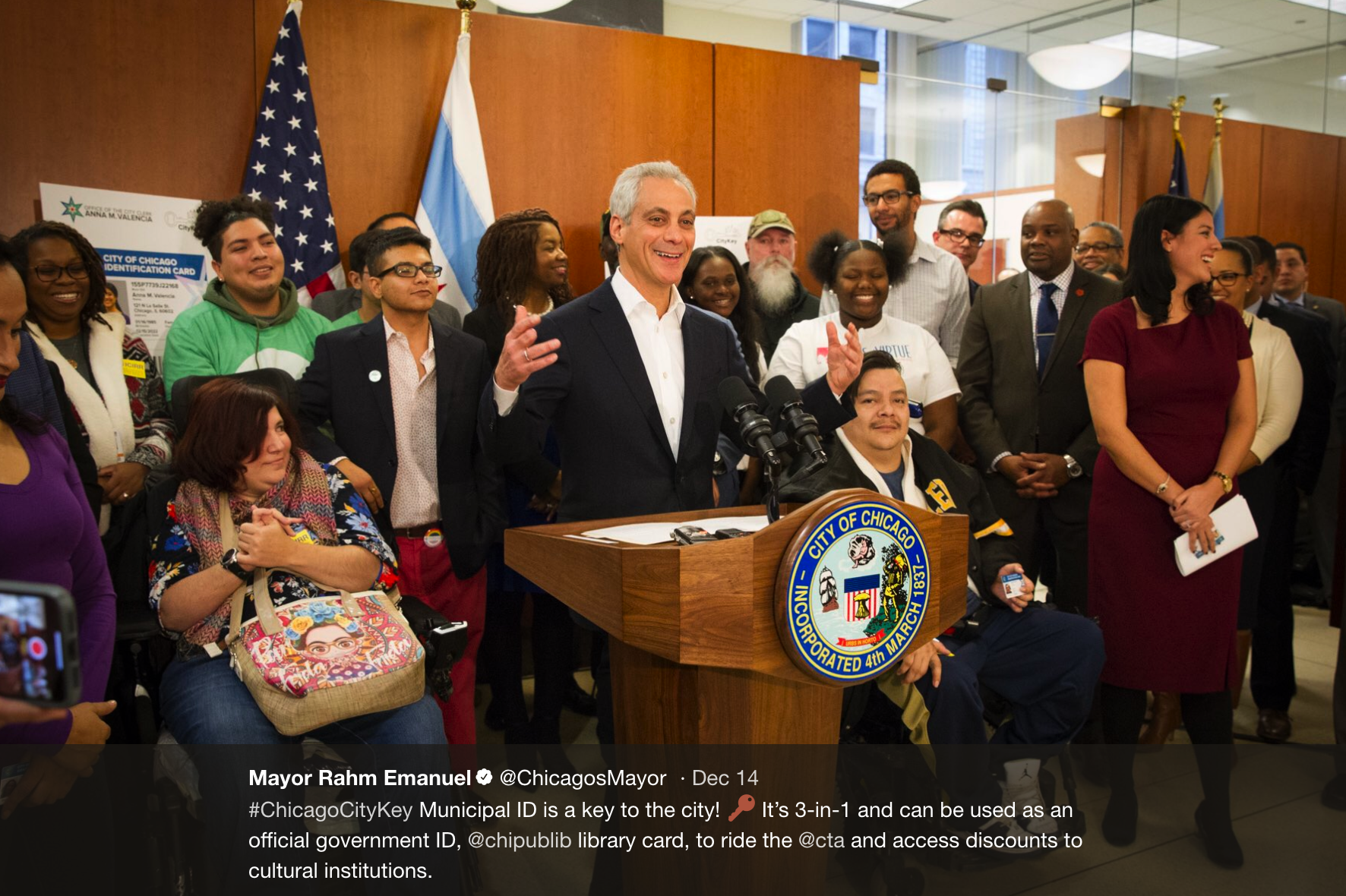
The City of Chicago was launching a municipal ID program, much like predecessors in Detroit, New York, and San Francisco. But Chicago's was different: it would be the first ID of its kind to integrate library card and public transit access, as well as discounts on cultural institutions and attractions. Ultimately, the program would give far-reaching access to all city residents from families and teens to the homeless and undocumented.
Our team worked with the City Clerk to get at the core of the program and find their Passionate Purpose, which was then used to fuel a naming exercise and drive creative.
The keyword "access" led us to the name CityKey, and the card's design took a cue from our simple but meaningful name.
My roles: Brand strategy, creative briefing, naming, art direction


The briefing was rich and inspiring, and we used the exercise to bring together larger teams within the agency so we could all contribute to paying it forward to our city.
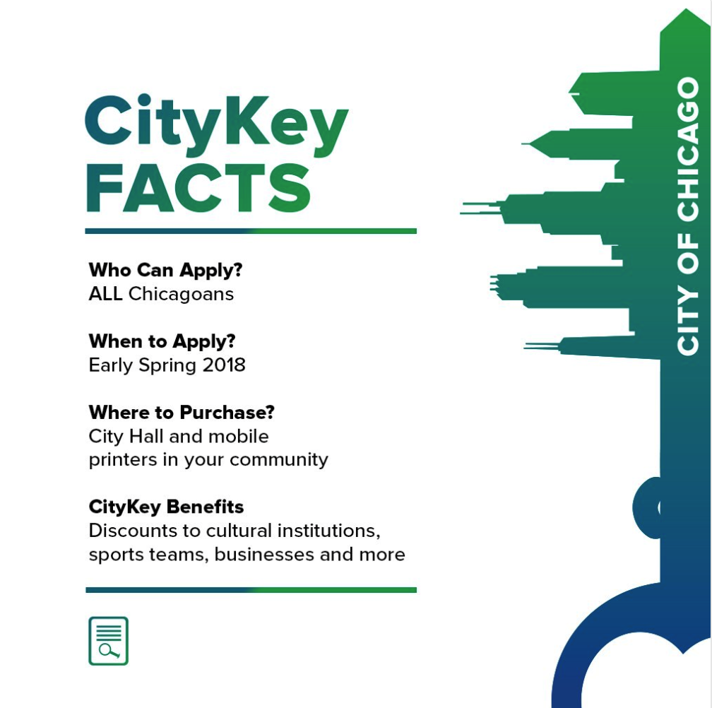
The name clearly inspired the look and feel of the card, using the city's skyline to form the peaks and valleys of the key. Just like locks and keys, each resident's experience using the CityKey will be personal and unique to their own identity, thus giving even more meaning to its core use as an 'identification' card.


