For brands that are just getting started or ones that need a refresh, I can get you ready to go with everything from strategy, messaging, and brand tenets to comprehensive brand guidelines and blueprints for go-to-market. Oh, and all the basics (ahem, logos, colors, type), too. Check out some suites I’ve created alongside their owners and founders:
Foundational branding
Tree Streets Dental
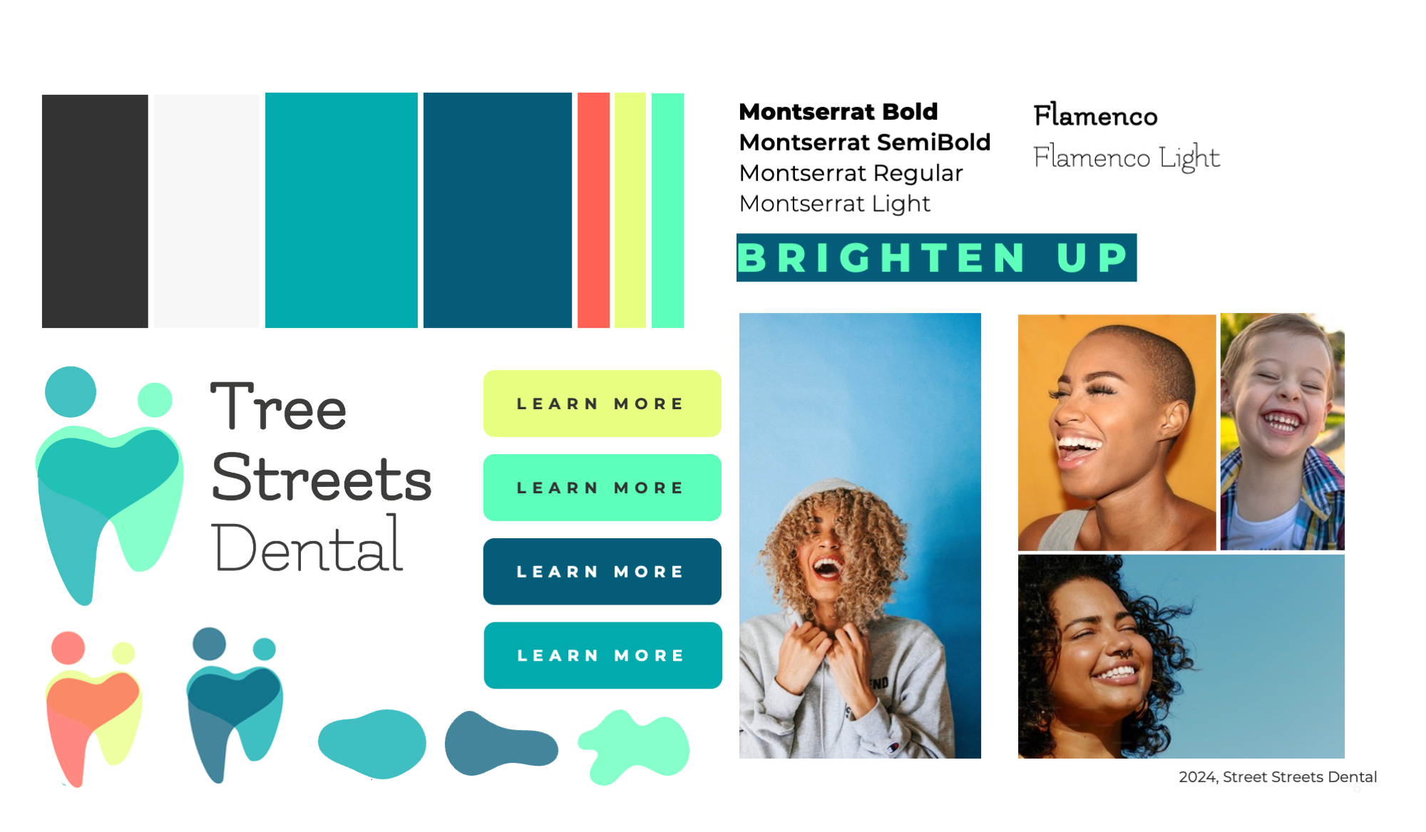
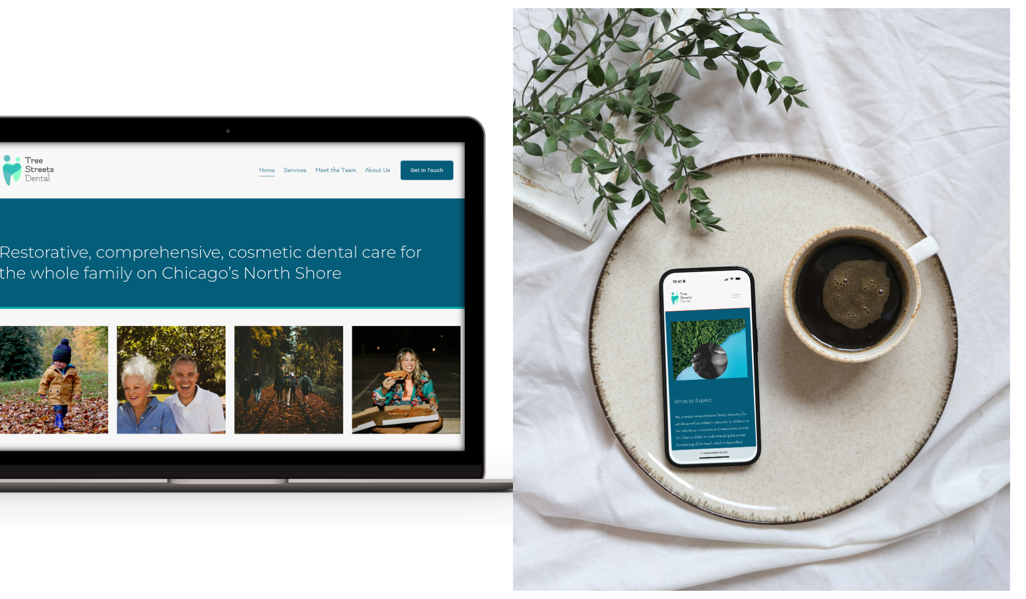
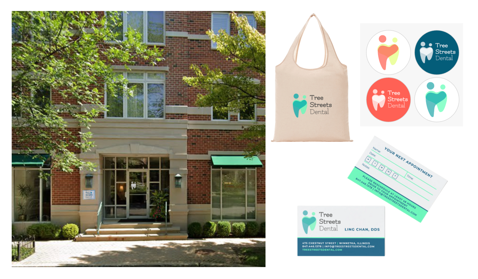
Taking over an existing dental practice in Winnetka, Illinois, Ling Chan wanted to infuse her bubbly personality into the brand, ensuring patients always felt brighter (even after a typically unpleasant outing like going to the dentist). We created a simple, flowing brand language that would welcome patients of all ages to the neighborhood office and help them brighten up at Tree Streets Dental!
Tree Streets Dental
Strom Advisory Group
Veteran Chicago lawyer Neal Strom wanted to take his talents for understanding people to the next level, creating an innovative legal “matchmaking” service. When clients are looking for the right firm to represent them, they just want the quickest and most obvious solution. However, moving forward with the most obvious solution — something you remember from TV or find at the top of the Google results — is simply wrong for their case. Strom Advisory Group will help you find representation that’s right for their unique case. The brand’s consistent use of locator icons and arrows emphasizes Strom Advisory’s commitment to leading clients to the right place and accompanying them on the case’s whole journey.
Strom Advisory Group
L.E.A.P. Year
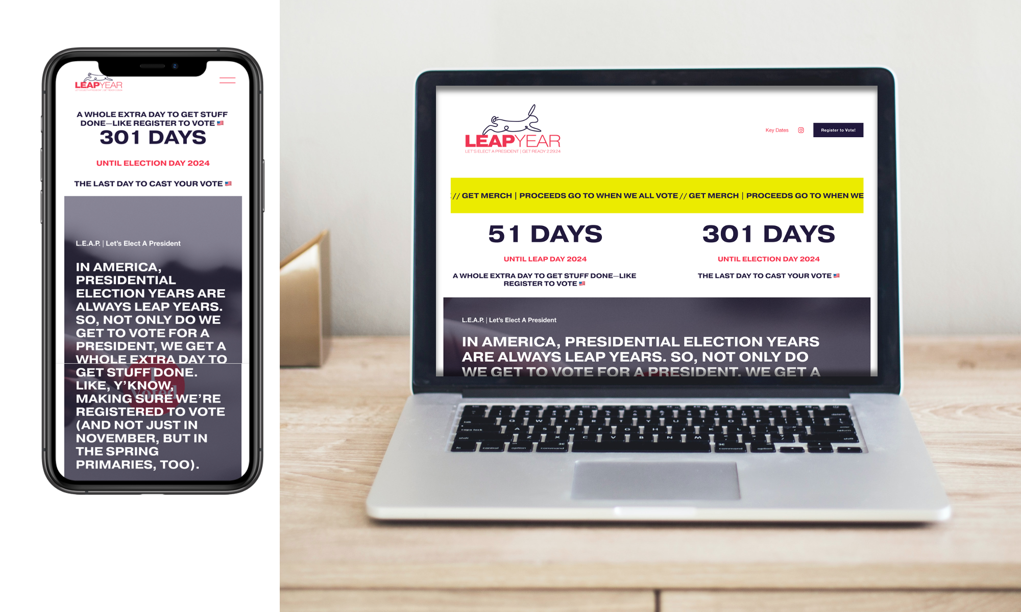
In America, every presidential election year is also a leap year. Which means we all get a whole extra day to get our sh*t together when it comes to voting: make sure we’re registered, research candidates, vote in primaries, and help our friends & family do the same. Following the bold action of brands like When We All Vote, L.E.A.P. Year makes sure we can all join into its mission: Let’s Elect A President.
L.E.A.P. Year
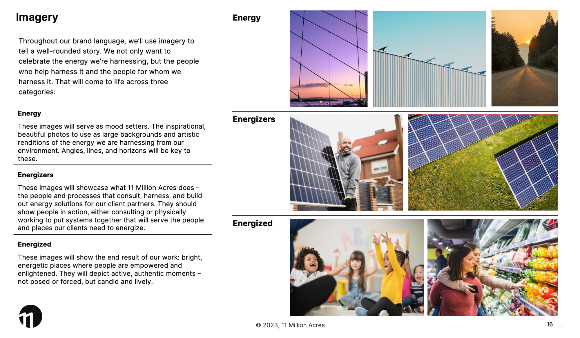
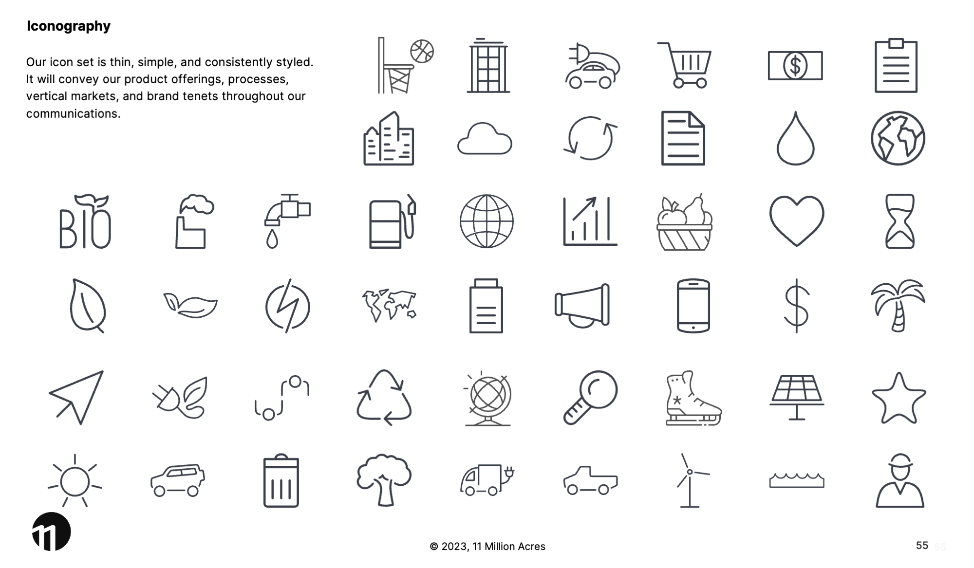
11 Million Acres
Combining energy innovation and real estate development, 11 Million Acres is a growing startup in Chicago and beyond. While their business is inherently "green" in its energy production, they really wanted to stand out from all the typical green energy companies in the world, as we opted for electric brights against dark navy backgrounds. The result was a tech-forward feeling in a world where competitors all feel too similar.
Milwaukee with Kids
Frustrated with how difficult it was to find fun, different things to do with her kids in Milwaukee, Calie Herbst founded Miltown Moms in 2013. After five years, it was time for a refresh to bring a bolder, more deliberate look to her growing brand. The logo represents the Milwaukee lakefront (sun, land, water) and the two Ms represent a mother & child. Colors, type, and icons were meant to be joyful, but not childish. The site's audience is savvy, exploring moms (not their kids). In 2019, she rebranded to Milwaukee with Kids to ensure more inclusivity for all parents and caretakers.
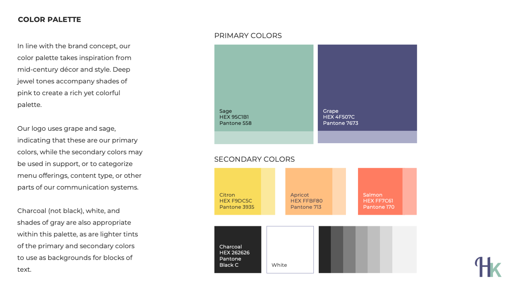
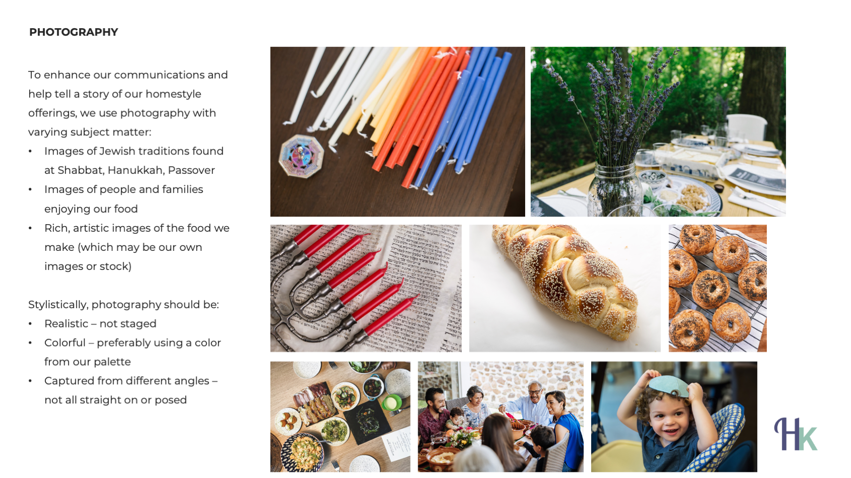
Hannah’s Kitchen
Hannah’s Kitchen, Milwaukee’s premier Kosher and Jewish catering company, was looking for a refresh to give the brand a more consistent feel and point of view. Primarily serving an older generation, Hannah’s Kitchen was looking for a branding suite with a homestyle feel that would honor traditions but still attract millennials with families. Drawing from mid-century modern motifs and natural, food-based colors, the updated look brings polish to Hannah’s and its retail sub-brands, HK Cafe and Hannah’s Cabana.
Accelerate
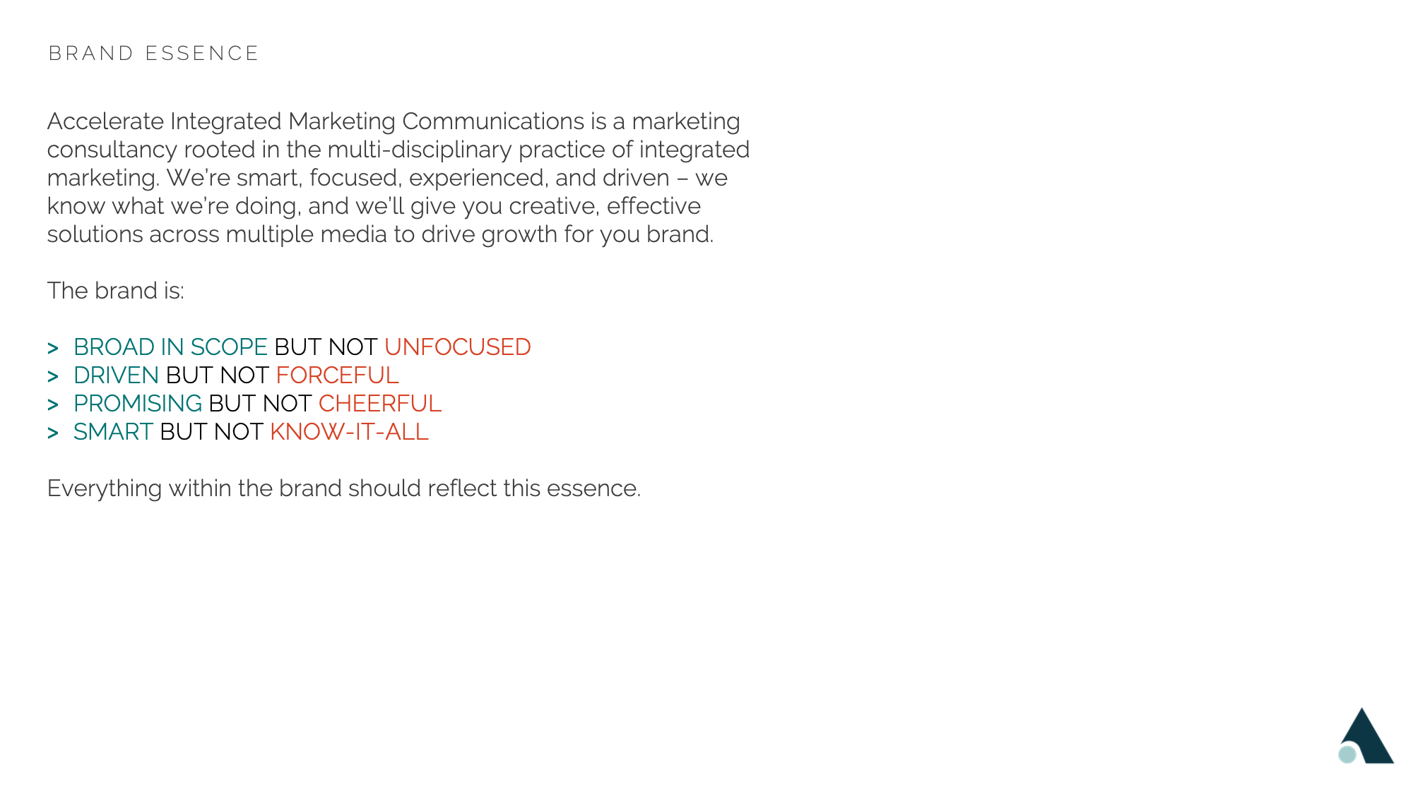
Accelerate Integrated Marketing Communications is a marketing consultancy rooted in the multi-disciplinary practice of integrated marketing. They wanted a brand that would communicate a smart, focused, experienced, and driven tone – they know what they’re doing, and will give clients creative, effective solutions across multiple media to drive growth for their brands.
CarePool
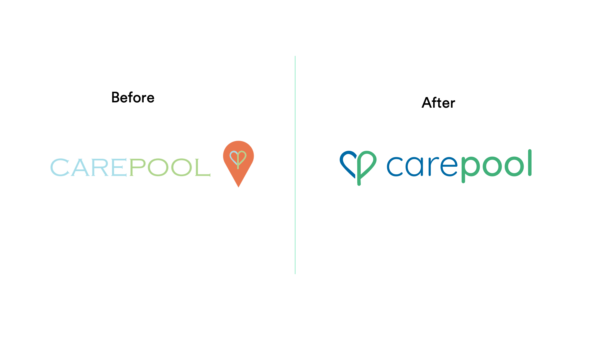
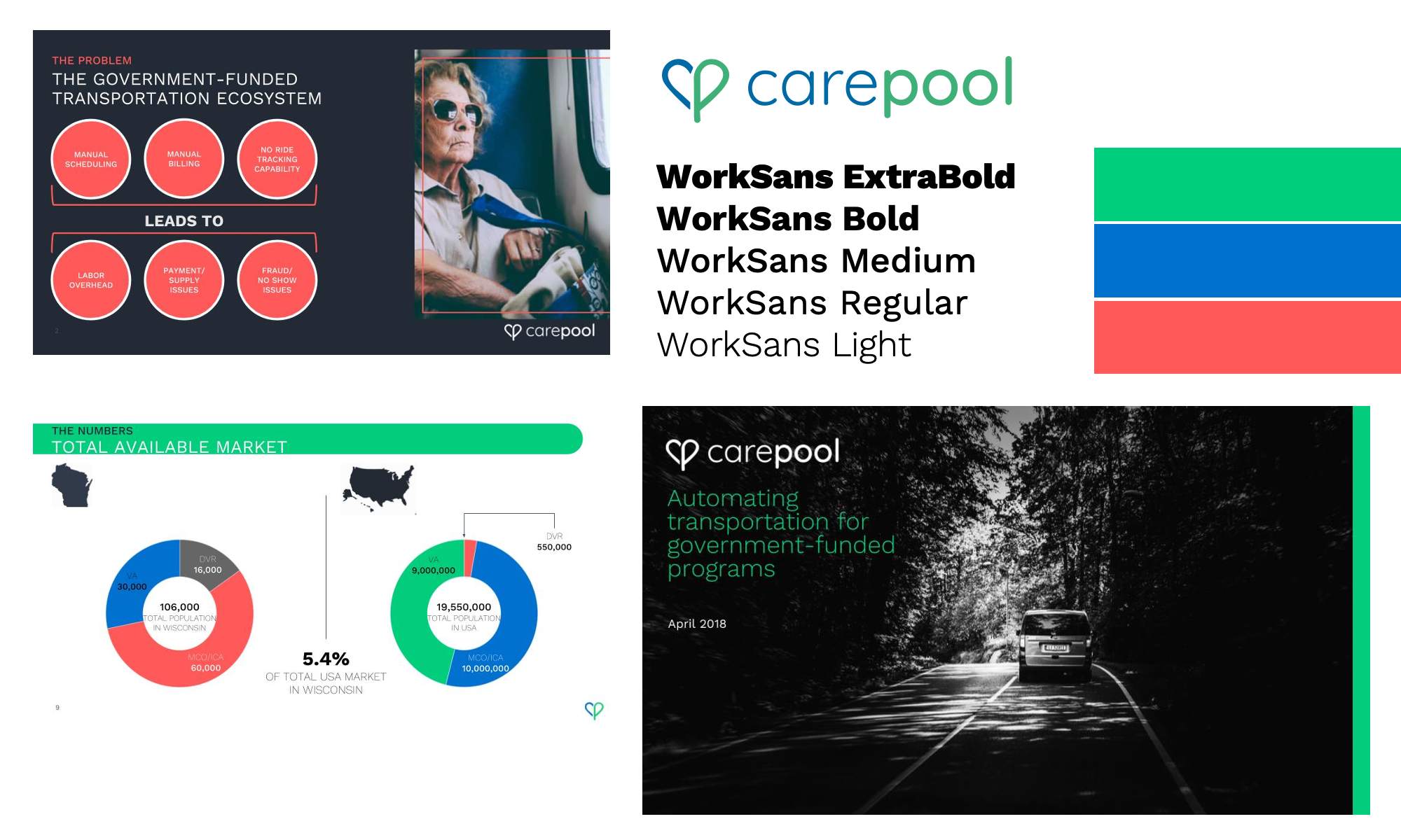
This startup, taking on the persistent problem of transportation for the elderly and disabled, wanted to be seen as both a tech company (like the growing number of rideshare apps) and a healthcare company. This simple re-design of their logo and bolder, simpler colors gave them a strong look for approaching investors.
And here are some branding suites I’ve built as part of agency teams:


